Design system. Components, tokens, rules.
A visual system for one-pagers, decks, and presentation pages. Light, type-led, opinionated. Most pages are a headline, two columns, and breathing room. Anything more should earn its place.
Colors
Two grays do most of the work. Use color for hierarchy, not decoration.
Typography
Inter only. Weights 300, 400, 500, 600. Print uses pt; web uses rem with clamp() for fluid scaling.
The headline pattern
Bold-then-dim. Anchor + extension. The most consistent visual identity in the system. Use it on every headline that has the room.
Anchor. Extension that fades.
One spec. Full transparency.
The bottleneck moved.
The tools changed. The instinct is still yours.
Same method. Whole organisations.
Eyebrow + Headline + Subtitle
The default opening of any section. Eyebrow tags context. Headline carries the message. Subtitle gives one line of nuance.
From spec to production.
One framework across four pillars. Agile ways of working, spec-driven development, tooling pipeline, and AI-enhanced code review.
Two-column (problem / fix)
Equal columns, gap 30–40pt. Each column has H4 + paragraph. Use for contrast: before/after, problem/solution, today/with-us.
The problem
The situation today. Be specific. Avoid abstractions. The reader should recognize their own pain in the description.
The fix
What you built. Two or three sentences that explain the solution. Match the tone and length of the problem column on the left.
Three-column (why / how / what)
Three equal columns. Used for structural breakdowns. Each column gets a 1-word title and 1–2 sentences of body.
Why
The bottleneck shifted. Writing code is easy now. Everything around it is where teams lose speed.
How
One framework across four pillars. Agile, spec-driven development, tooling pipeline, AI-enhanced review.
What
Your teams aligned on one pipeline, shipping with confidence. Foundation in place in 8 weeks.
Capability list (Q&A)
Rows separated by thin borders. Question on the left (medium weight). Answer on the right (regular, dim). Used for "what it solves" sections.
Callout (dark block)
Black background, white text, rounded 6pt. For "Why now" or other emphasized sections. One per page max — too many and the emphasis stops working.
Why now
The moment lands here. The key insight in bold. Then the supporting context. One callout per deck max. More than that and the emphasis stops working.
Dot flow
N horizontal steps connected by a thin line. Each step: 9px black dot, label, dim caption. Used for process flows.
Spec
Intake & standards
Plan
Agent drafts, human approves
Execute
Sandboxed, spec-locked
Review
AI first, human on substance
Deploy
Gated to production
Stack grid
Four-column grid of category cards. Each card has uppercase label + tools with small monochrome SVG marks. Used to show "the stack."
Spec block + context + outputs
Vertical flow: dark spec block at top → context pills with "draws from" prefix → "AI orchestrates" divider → three output cards. Shows how a system processes input.
The Spec
Anyone writes it — everything else follows
Tickets
Auto-populated, synced in real time.
Execution
Agents start building immediately.
Review & deploy
Pipeline gates every merge.
Product slide (showcase style)
Big product name on the right. Description on the left with /0n number, tag, headline, body. Used for product overviews and storytelling about builds.
JEDUF three-column
Three columns showing extremes vs middle path. Outer columns light. Center column dark as the hero. Steps stacked vertically inside each column. Optional impact line below steps summarizes the outcome.
Timeline
Vertical timeline with year labels, connecting dots, and content. Used for journeys, histories, roadmaps. The connecting line hides on the last row automatically.
The starting point
Where things began. Initial conditions and constraints.
Early progress
First experiments. Initial wins. Lessons learned.
Where we are
Current state. What's been achieved. What's next.
Stat grid
Big numbers with context. Three cards in a row. Use .stat-dark on one card to highlight the hero metric. Weight 600 on the number for emphasis.
Quote pair
Two perspectives side by side. One light, one dark. Used for debates, contrasts, or "what they said vs what we heard." Attribution below a border-top.
Logo grid
Four-column grid of partner/client cards. Each has a monochrome mark (swap for <img> with real logos), name, and role/team label. Used for "who uses this" slides.
Code block
Dark rounded frame with macOS-style header dots and a filename. Monochrome syntax highlighting via semantic classes: .c-keyword, .c-comment, .c-string, .c-dim.
<!-- A slide is just a section -->
<section class="slide">
  <div class="slide-inner">
    <h1>Anchor. <span class="dim">Extension.</span></h1>
  </div>
</section>
Tone & voice
Opinions. Lean into them. The voice is part of the design.
- Bold the keyword. Dim the rest. That's the rhythm of every headline.
- No em-dashes in body copy. Use periods or split into shorter sentences.
- If a sentence doesn't add information, delete it.
- Use names, not pronouns. The product/feature/concept by name beats "it" or "this thing."
- Pick one term and stick with it. Don't paraphrase your own product.
- Numbers should be specific. 7× beats "huge gains." 35 use cases / week / engineer beats "much faster."
- Headlines are statements, not questions. Q&A rows are an exception — the question is the format.
Testimonial grid
3×2 quote cards with avatar, name, and title. For social proof and endorsement slides.
Logo bar
Horizontal row of partner or client names between hairline borders. For social proof in a compact format.
Feature card row
Three cards with title, description, and an inner mock element. For feature breakdowns and capability overviews.
Update row
Changelog-style cards with version badges and dates. For shipping cadence and release history slides.
Art overlay
Classical painting background with a UI mockup floating on top. The signature "craft meets code" visual. Swap the gradient for an actual painting via background-image.
Page formats
Three canonical formats. Each has its own conventions.
Slide deck
Single HTML, one slide per section. Arrow keys navigate. Light slides default; dark for emphasis. Progress bar top, counter bottom-right.
A4 one-pager
Fixed 210mm × 297mm. @page { size: A4; margin: 0 }. Sizing in pt for consistent print. justify-content: space-evenly distributes sections.
Web overview
Long-form layout, max-width 1100–1200px. Hero headline, then rows of products/sections. Used for landing-page style content.
Gap cascade
Two-column layout: text left, cascade card right. Steps fade and drift to show decay or convergence. Use for "old way / new way" narratives or any sequential process with a punchline.
Video slide
Full-screen video in a rounded container. Dark or light background. The container adapts to the video's aspect ratio. Use for demos, walkthroughs, or product recordings.
Scale proof card
Case study card with client logo, explainer text, and impact stats in a 3-column grid. Use to back up claims with real numbers. Logo top-right, subtle.
Closing slide (QR + CTA)
End slide with headline, subtitle, and a large QR code for audience connection. Two-column: text left, QR right. Keep the QR large enough to scan from the back of the room.
Code split (3-way)
Three-panel grid: agent chat, source code, rendered result. Shows the full workflow from prompt to output. Dark panels for chat/code, light for result.
Split slide (text + image)
Two-column grid inside .slide-inner: text on one side, rounded image on the other. Uses standard eyebrow + headline above the grid. Use .split-reverse to swap sides.
Hero image slide
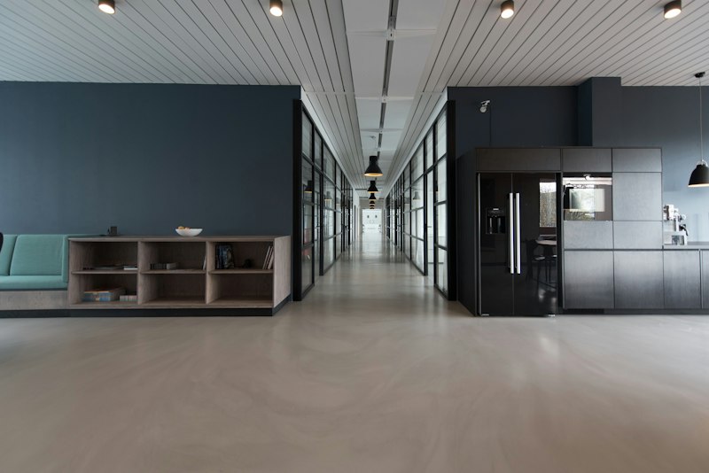
Rounded 16:9 image frame with gradient overlay and caption at the bottom. Lives inside .slide-inner like every other component. For cinematic moments that need a short headline.

Image card row
Three cards with 4:3 images and text below. For feature highlights, portfolio items, or category breakdowns. Keep descriptions parallel.



Caption slide
Large image with a slim annotation bar below. For showcasing a single image with context. The bar has a title and description side by side.

Image + quote
Portrait image paired with a pull quote. For testimonials, interviews, or any moment where a face adds weight to words. Use .image-quote-reverse to swap sides.

Photo grid
2×2 image mosaic with optional labels. For portfolios, team photos, location shots, or any "show four things" moment. Labels use a gradient overlay for readability.